Do you need help keeping up with the ever-changing world of eCommerce design? Do you need to catch up to your competitors regarding website aesthetics and functionality?
As an online business owner, staying updated on the latest eCommerce web design trends is crucial to staying competitive and boosting conversion rates.
Whether you’re looking to outsource eCommerce website design and development or make updates in-house, this guide is your faithful helper in achieving high conversion rates and standing out in a crowded online marketplace.
- How To Keep Up With eCommerce Design Trends?
- Top eCommerce Designs Trends in 2025
- Final Thoughts
Is A High Abandonment Rate Affecting Your Business?
Our solution includes a new theme with a hot feature set to re-engage customers and boost sales.

Our comprehensive guide to eCommerce design trends in 2025 will help you stay ahead of the curve and optimise your website for maximum impact.
Some tips on how to keep on top of eCommerce web design trends in 2025:
- Follow industry leaders and influencers: Keep an eye on what top eCommerce websites are doing and what influencers talk about regarding design trends. Social media platforms like Twitter, LinkedIn, and Instagram are great places to start.
- Attend eCommerce and design conferences: Attending industry conferences is a great way to network and learn from experts in the field. Many conferences offer sessions on eCommerce design trends and best practices.
- Read design blogs and publications: Many design blogs and publications cover eCommerce design trends and best practices. These resources can help keep you up to date on the latest design trends and techniques.
- Analyse your website analytics: Review your website analytics to see how your current design performs. Identify areas that need improvement and research design trends that could help improve those areas.
- Hire a professional design team: Consider outsourcing your eCommerce design to a skilled team specialising in eCommerce website design. They can help you stay on top of the latest trends and create a website optimised for conversion.
How To Keep Up With eCommerce Design Trends?
From intuitive user interfaces to personalized experiences, 2025 is set to this list explores the top eCommerce design trends for 2025 that are set to take the industry by storm. So, let’s dive in and discover what’s hot in eCommerce design:
Top eCommerce Designs Trends in 2025
Get an eCommerce Expert Consultation
Our Adobe Business Practitioner will audit and optimize your site for robust performance.

Gone are the days of static product images. In 2025, interactive visuals will take centre stage in eCommerce web design and development. These interactive visuals allow customers to see products from multiple angles, zoom in to see finer details, and even see products in action through 360-degree videos. Given that customers are more engaged with the product, it increases the likelihood of trying it out or, at the very least, considering it.
eCommerce businesses must invest in technology and tools to create interactive product visuals to exploit this trend. This may include 3D modelling software and high-quality cameras that capture detailed product images and videos.
- Interactive product visuals are crucial for online store design, as they play a significant role in engaging and retaining users. Here are some reasons why interactive product visuals are essential:
- Improved user experience: By allowing users to interact with the product, they can explore its features and benefits in detail, making it easier to understand the product and make an informed purchase decision.
- Increased conversion rates: The longer users interact with the product, the more likely they are to purchase.
- Reduced returns: Users can see the product from different angles, which can help them make an informed decision about its suitability before purchasing.
- Enhanced branding: By creating a visually appealing and interactive experience, online stores can improve brand perception and loyalty.
1. Interactive Product Visuals
These design elements add an extra layer of interactivity to the shopping experience. For example, hovering over a product image may trigger an animation that shows the product in use or highlights its key features.
These elements can create a more dynamic and engaging pitch for customers since they can discern the products quickly and easily.
2. Hovering Effects, Illustrations, and Animations
Interactive and static 3D content allows customers to experience a realistic simulation of real products using digital technology. Because it can’t break or wear, the 3D model can be experienced with great detail.
3D content is becoming increasingly popular, allowing customers to:
- See products in action,
- Better understand how they function,
- See products from multiple angles,
- Take a closer look at the finer details they may miss in static images.
These interactive visuals create a more enjoyable shopping experience, boost customer engagement, and ultimately lead to higher sales conversions. Here are some ways in which 3D content can help:
- Better visualisation of products: This makes it easier for users to understand the product’s features and benefits and make an informed purchase decision.
- Improved product understanding: Interactive 3D content can give users a more comprehensive experience of the product’s features, benefits, and functionality. This can reduce the need for extensive product descriptions and help users make a more informed purchasing decision.
- Enhanced personalisation: 3D content can be customised to match the user’s preferences and requirements. This can provide a more personalised shopping experience that can increase the chances of conversion.
In eCommerce, a product page can make or break a sale. A well-designed and visually appealing product page can capture customers’ attention and increase their interest in a product. In 2025, the trend leans toward creating more engaging and memorable product pages.
eCommerce businesses achieve this by using catchy headlines that grab customers’ attention. These headlines should be concise and descriptive, giving customers a quick snapshot of the product and why they should consider buying it.
In addition to catchy headlines, high-quality product images are also essential. Customers want to see products in detail, and high-quality images can help, especially when taken from multiple angles with zoomed-in shots that showcase the product’s features and details.
Other elements that can help make a product page more engaging include incorporating customer reviews, displaying related products, and providing clear and concise product descriptions. By creating a visually appealing and informative product page, eCommerce businesses can increase their chances of making a sale and building customer loyalty.
- Providing a product comparison feature can help users compare different products side by side and make an informed purchase decision.
- User-generated content: Displaying user-generated content, such as customer photos or social media mentions, can provide social proof and build trust with potential customers.
- Upsell and cross-sell suggestions: Displaying upsell and cross-sell suggestions can encourage customers to purchase related products or upgrade to a premium version.
- Product bundles or packages: Offering product bundles or packages can provide a better value proposition and increase the likelihood of customers purchasing.
4. Catchy Product Page
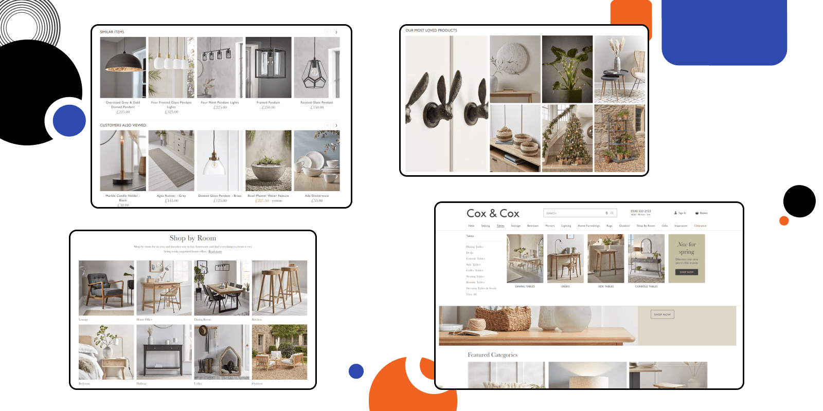
Traditionally, eCommerce websites have used a linear layout where customers navigate the site in a specific order. However, in 2025, the best eCommerce design layouts shift towards multidirectional layouts that allow customers to navigate the site in a non-linear way.
This type of layout can create a more dynamic and engaging shopping experience for customers, as they can explore the site in the way that makes the most sense for them. This type of layout can also be helpful for businesses with many products, as it can help customers find what they’re looking for more quickly and easily.
5. Multidirectional Layouts
Artificial intelligence (AI) and chatbots are becoming increasingly popular in eCommerce design. These features can help customers find what they’re looking for, provide personalised recommendations, and even assist with checkout.
Chatbots can also be used for customer service, answering frequently asked questions and helping customers troubleshoot issues. By incorporating AI and chatbots into eCommerce websites, businesses can provide a more seamless and efficient shopping experience, increasing customer loyalty and sales.
Here are some reasons why you should consider implementing AI and chatbots on your eCommerce website:
- 24/7 availability: AI and chatbots can provide 24/7 availability to customers, allowing them to get assistance and support anytime. This can improve customer satisfaction and loyalty.
- Improved customer experience: AI and chatbots can provide personalised recommendations and support based on the customer’s behaviour and preferences. This can lead to a better customer experience and increased sales.
- Increased efficiency: AI and chatbots can handle a large volume of customer queries and requests simultaneously, reducing the workload of your support team and improving efficiency.
- Reduced costs: By automating customer support tasks, AI, and chatbots can reduce labour costs associated with human support teams.
- Data collection and analysis: AI and chatbots can collect and analyse customer data, providing insights into customer behaviour, preferences, and pain points. This can help you improve your product offerings and marketing strategies.
6. AI & Chatbots Features
Supercharge Your Store for the Sales Rush!
Ensure peak season success. Our Adobe Business Practitioners conduct site audits to optimize your eCommerce weaknesses.

With more and more customers shopping on their mobile devices, it’s crucial to prioritise mobile navigation in eCommerce design. This means using a responsive design that adapts to different screen sizes and optimising the navigation menu for mobile users.
Additionally, mobile navigation should be as simple and intuitive as possible, so customers can quickly find what they’re looking for and complete a purchase.
- Increased engagement: By providing an intuitive and easy-to-use mobile navigation system, you can increase user engagement with your website. This can lead to increased time spent on the site, more page views, and, ultimately, more sales.
- Higher search engine rankings: Google and other search engines prioritise mobile-friendly websites in search rankings. By implementing mobile navigation, you can improve your website’s mobile-friendliness and rank higher in search engine results.
- Reach more customers: With more than half of all internet traffic coming from mobile devices, implementing mobile navigation can help you reach a wider audience and tap into the growing mobile market.
7. Mobile Navigation
In 2025, we’re seeing a focus on making eCommerce websites more accessible to customers with disabilities. This includes features such as screen reader compatibility and text alternatives for images.
Additionally, eCommerce businesses are expanding their reach by offering products on multiple platforms, such as social media and marketplaces. By making their products available on various platforms, businesses can reach more customers and increase their chances of selling.
8. Accessibility and Availability
Page transitions may seem like something you don’t need to worry about, but they can significantly impact the user experience. Creative page transitions can create a more seamless and enjoyable shopping experience for customers.
For example, a fade-out effect when transitioning between pages can make the experience more fluid and natural. Other beautiful eCommerce websites use page transitions like animations or videos to create a sense of movement and interactivity.
9. Creative Page Transitions
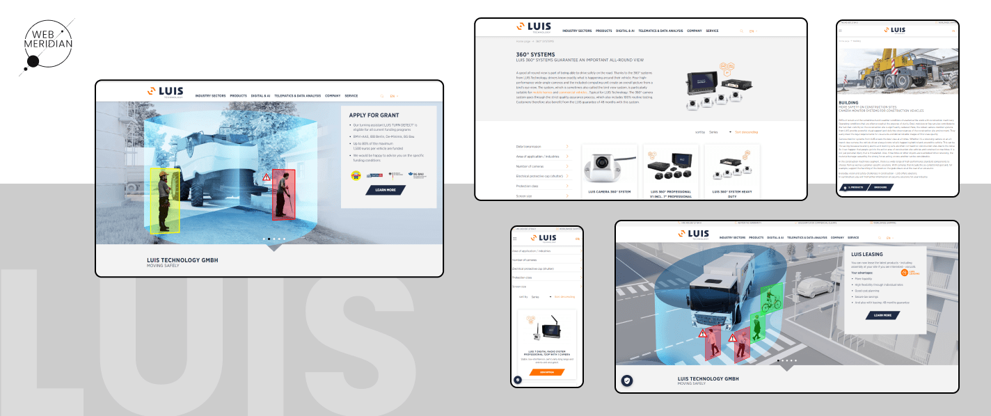
Neutral colours like beige, grey, and white are becoming commonplace in eCommerce design. Gone are the days of websites that splashed colour everywhere to get your attention. Neutral colours provide a clean and minimalist aesthetic that highlights products and creates a sense of sophistication.
Neutral colours can also create a sense of calmness and simplicity, which can help customers focus on the products and make the shopping experience more enjoyable.
10. Neutral Colours
Incorporating eCommerce web design trends into your online store is an excellent way to enhance the user experience, boost engagement, improve search engine rankings, and reach more customers. At the same time, it can give you a competitive edge in the market.
Our company has a team of experienced designers who specialise in creating unique and tailored designs for Magento eCommerce websites. A well-designed website can make a significant difference in the success of your business. Therefore, we take a strategic approach to every project and ensure the design aligns with your business goals.
If you’re looking to launch a new Magento website or revamp an existing one, we’re here to help. Our skilled designers will work with you to create a design that not only looks visually appealing, but also drives conversions and increases sales.
Contact us today to learn more about our Magento web design services and how we can help take your online business to the next level.
Final Thoughts
No More Lost Customers!
We offer tech audit and implementing of new theme with a hot feature set to rekindle customer interest and drive additional sales.
