The web page design is intricate and reflects the personality of your company. People will remember you or get fascinated enough to make a purchase if you do an excellent job of explaining who you are and what value you have to offer
In a nutshell…. What are the most crucial pages on an eCommerce site?
Each page used in your well-thought-out shopping funnel:
- Homepage
- Product listing page
- Product detail pages
- One-step-checkout
When users visit your website, they may seek something specific or simply surf. It is up to you to leverage your company’s “face” to let them know you have what they are searching for or that they could find something intriguing if they dig a little further.
These questions will assist you in creating an experience that considers how your site visitors feel as well as your own needs to market what you are selling.
- What do you want people to do when they arrive at your website?
- How straightforward is it for them to do what you want them to do?
- How many steps do they need to take to achieve their objectives?
- How much information do they need before they can carry out the activities you want?
- Can you eliminate any stages to shorten the journey to your goals?
With these questions answered, you’ll be one step closer to creating a functional homepage.
- Best Practices of Homepage Design
- Product Listing Page Best Practices in 2022
- Cutting-Edge Trends in Product Listing Page Design
- Best Practices for Product Detail Pages Design in 2022
- The Best Product Detail Pages Examples
- Takeaways
- Conclusion
No More Lost Customers!
We offer tech audit and implementing of new theme with a hot feature set to rekindle customer interest and drive additional sales.
Your site is the face and voice of your business. It is where everyone will seek information on what the website is all about. It is also where you may put coded and explicit messages to compel your site users to take action.
- To communicate without leaving out any demographic, use solid and engaging content as well as aspects of the UX and written text.
- Website designers must ensure that they can bring the visitor’s attention to the proper locations without overloading them with too much information when it comes to navigation.
- Maintain consistency in your brand’s colours, typefaces, messaging, and other distinguishing features. People remember things by association, and a minor colour change might make you invisible.
- Websites have emotions. Those emotions are colour palettes. A website without strong colour palettes feels desert-like and desolate.
- The cart is another necessary element to the homepage of a retail website. It should be easy to find. It should also be placed in the upper right corner. It is preferable if the cart can indicate the number of things placed in it on a little symbol.
- Finding anything on your website should be simple, especially if you have a large catalogue. If you have many items, the consumer should be able to find what they are looking for by utilizing a website search bar.
- Your homepage is an excellent spot to promote any exceptional deals you may have.
- You undoubtedly understand how critical it is to simplify your homepage design for mobile phones while preserving an intuitive and smooth user experience during mobile buying.
Best Practices of Homepage Design
- mophie
- Harvey Nichols
- Banbayu
- Cox&Cox
- The New Craftsmen
5 Examples of the Excellent and Innovative Homepage Design
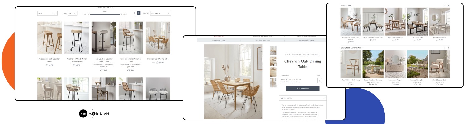
Product Detail Pages. Source: Cox & Cox
Although product listing pages appear to be relatively straightforward—you simply guarantee that all the goods accessible in your catalogue are included, right?
There are best practices to follow if you want the user experience to be as fantastic as elsewhere in your eCommerce business. You want customers to:
- find the perfect product for them
- complete a purchase,
- MOST IMPORTANT: not leave your site frustrated and annoyed by how difficult it is to get to what’s relevant to them.
It’s an excellent start if you already have filters for categories, product kinds, and pricing ranges. But here’s what you can do to improve conversion rates on your product listing pages.
Product Listing Page Best Practices in 2022
Let’s Dive Deeper Into Pitfalls and Tips of the Product Listing Pages Design
- Users should be able to access the most popular filter attributes first since filters should be arranged by popularity.
- On scroll, filters ought to be sticky, especially for mobile devices.
- When filter qualities are chosen, they have to be noticeable and persistent.
- Filter characteristics ought to display how many related goods there are.
- Users should be able to clear certain attributes instantly.
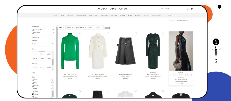
Source: Moda Operandi
Step #1. Filters
Get A Magento Expert Consultation
Our Adobe Business Practitioner conducts site audit to optimize your eCommerce weaknesses.

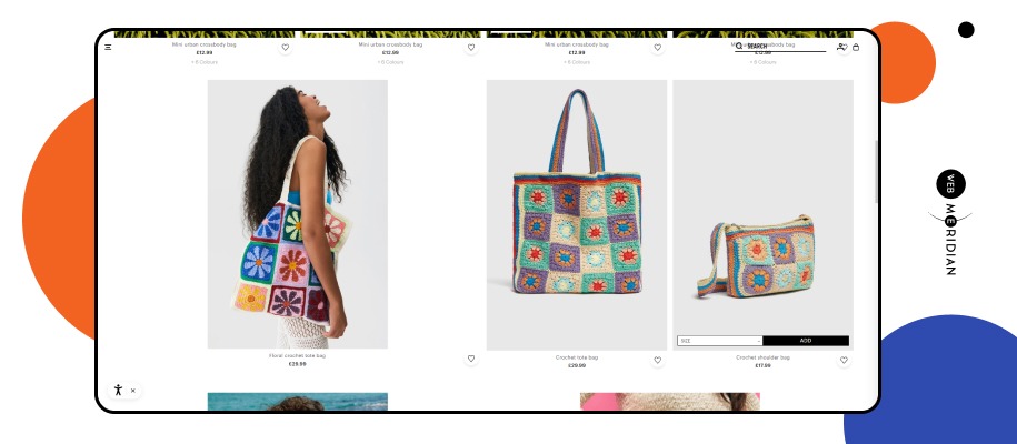
- Secondary photos must be accessible while hovering on desktop computers.
Source: Rent The Runway
- Quick “Add to Cart” ought to be available.
- It is advisable to have backup CTAs (e.g. Wishlist, Compare)
- The presentation of ratings is necessary.
- Clear emphasis on discounted rates is essential.
- To separate products, you should utilize badges.
Step #2. Product Pods
- For SEO reasons, You should include a title, breadcrumbs, and a further product category description.
- The page’s bottom should have pagination or a “Load more” button.
- It should be clear at the top how many goods are listed overall on the page.
Step #3. Synergy of SEO and UX design
- First, fake product pods
The purpose of these “fake” product pods is to promote other product categories, display a message, or provide more information about the product category or type customers are now browsing.
- Boxes at the top of the page listing product categories
Many brands are beginning to do this, graphically exhibiting various product categories or types in order to inform customers about product variants and aid them in seeing additional options.
- Product pods with browsable images of products
Brands have begun to provide the opportunity to explore all available product photographs immediately on product listing sites. They use the product pods, so visitors don’t have to travel to product information pages to see all the product photos. Website visitors return and do the exact several more times. It improves the experience and is quick and convenient!
Cutting-Edge Trends in Product Listing Page Design
Don't Let Peak Seasons Overwhelm Your Site!
Say goodbye to site crashes during discount seasons. Hire Magento expert and Adobe Business Practitioner whose will audit and optimize your site for robust performance
The product detail page is where you provide details about a product. Typically, it has a call to action (CTA) to put the item in the shopping bag along with a few images, a description, the price, and most significantly, a call to action. Yes, it sounds like it would be pretty easy to assemble. The user experience on product detail pages can quickly deteriorate if best practices are not followed. We do not wish that.
Best Practices for Product Detail Pages Design in 2022
Refresh Your eShop With These Tips of Effectively Sale Product Detail Pages
The top eСommerce sites provide fantastic items as well as fantastic product images. These pictures demonstrate the worth and grade of your goods and give a sense of transparency in your online store.
- Macro shots are super close-ups.
- Create a scene. “Don’t sell the mattress, sell a good night’s sleep.”
- Freeze-frame photographs are downright cool.
- Show all product variations. Don’t rely on your customers to simply imagine what your product looks like in a different colour — show them.
- Show the product in use. Before you take your product photos, brainstorm with your team about exactly what your ideal customer wants from your product.
Source: Bellroy
- Use 360-degree photos, let your customers feel like they are in a brick-and-mortar store and look at your products from all angles.
- Show people. According to research by Toluna, more than half of people connect more with media that features real people.
- Using props is another way to help your customers imagine the different ways that your product(s) will be of use to them.
- Don’t forget about zoom functionality.
Step #1. Product Photos
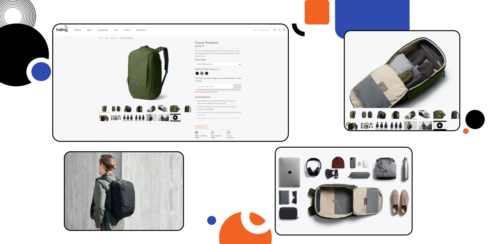
Source: Bellroy
The majority of CTA buttons are connected to links that swiftly advance site visitors to the following stage of the buying process. It is seamless and efficient when done correctly.
- Concerning visual hierarchy, the main CTA should be noticeable.
- There should be more CTAs accessible (e.g., Wishlist, Compare)
- It should be possible to choose to be notified through email when an out-of-stock item returns.
- The add-to-cart button should be sticky if there are three to four folds on the product detail page.
Source: The North Face
Step #2. Call-to-Action
Some customers might rely only on product images and reviews, while others want to read and fully understand this information.
- Comprehensive and original product description.
- Details on delivery and return.
- Create a unique description.
- Make sure website visitors can easily scan the product description.
- Adapt the copy to your target audience.
- Unique selling points.
- Optimize your product description.
- Tell a story about the product.
- Split test your product copy.
- Spell check your product description.
- Include the fine details like product specs and measurements.
- Using keywords may produce relevant content, which improves your chances of making sales.
- Increase localization to address the desired target audience directly.
- Your writing should be accurate and informative while also reflecting the nature of your company.
- Create a strong foundation for your writing and include a call to action at the conclusion.
Step #3. Text
Users frequently overlook this section, although it is crucial for conversion. More customers may click the “Add to cart” button if you add a few subtle reminders to the product description page.
- Social evidence
- Display how many times the item has been added to a wish list.
- Utilising scarcity
- Display the number of other buyers that are considering the same product.
- Include a countdown timer to the end of a limited-time promotion.
- Cross-sells and upsells
- Viewed things recently
Step #4. Inspire Customers to Buy
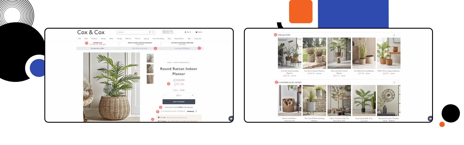
Source: Cox & Cox
When a product is no longer available, it suddenly becomes more desirable. Because of this, Allbirds distinguishes between their limited edition products and their classics and emphasizes the latter’s rarity.
The business provides a sizing chart that opens on the same page to help website visitors comprehend their items better. They avoid the possibility of losing the visitor on a new tab in this way.
By supplying customers with a variety of payment options on their website, Allbirds lowers the barriers to purchase. And customers may view those choices prior to reaching the checkout page.
The brand employs several viewpoints to exhibit the goods, as well as a model video to demonstrate how the shoes seem and feel while worn.
As you continue to scroll down the page, you come across a section devoted to user-generated content that features images of the items in use.
Last but not least, Allbirds employs out-of-stock notifications to add warm leads to their email list. They ask if you’d like to join their email list in addition to alerting you when the item is back in stock. The value-driven content (“Let me know about new goods, colours too.”) and pre-selected checkboxes are how they do this, though.
By doing this, the business gathers highly interested leads that they can then use to target with customized email marketing.
The Best Product Detail Pages Examples
Allbirds
One of the top three considerations for customers when choosing an e-commerce site is price.
Make sure your customers are aware of any discounts you may be giving or any lower costs than your competitors if you have an online business.
Compare it to the original pricing as one technique to emphasize your price advantage.
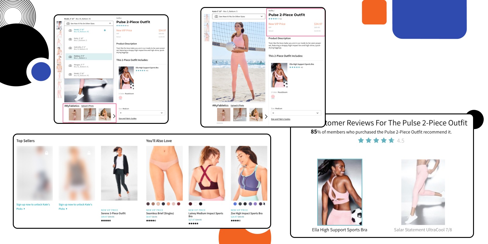
Fabletics does it as follows on their product pages.
Their “New VIP Price” is twice as cheap as the list price. Additionally, it entices customers to think about purchasing the goods (together with a VIP subscription.)
Although businesses make an effort to show their items from a variety of perspectives, it won’t seem the same if two different people wear the same item.
Because of this, Fabletics gives you the ability to select from a variety of models to help you imagine how their items would seem on you.
Additionally, Fabletics curates client photos underneath the model images if you like to see the goods on actual people rather than just models.
You’ll notice that the firm conceals some of the products that may be unlocked upon joining up when you scroll down to the product recommendations.
Curiousity and a strong sense of membership exclusivity are sparked by hidden items.
The business makes it easier for you to quickly understand the product without reading all of the testimonials by adding a summary section on top of the product reviews.
Fabletics
- Make limited-time or limited-stock items stand out on your product pages if you’re selling them.
- Provide diagrams and manuals that open on the same page.
- Think about including several payment alternatives on your e-commerce website.
- Create brief commercials and product promotions using a video editor to show the product in use.
- Utilize a third-party program, such as Olapic or Curalat, to curate user-generated material.
- Use out-of-stock notifications and get consent before adding customers to your email list.
- Compare your membership fees to those at nearby stores.
- Add a variety of product images in various settings.
- Utilize customer images in your product photography.
- Include a few items that are hidden or accessible only by joining up.
- Describe the product reviews in brief.
Takeaways
Your eCommerce site’s heart and soul are its Product Detail Pages as well as Product Listing Pages. You may raise your sales income and attract more clients by making a few little changes.
You may be losing a lot of money with a poorly optimized product page for your online business. On their product pages, good eCommerce firms use at least one CRO method. They provide product suggestions, appeal to visitors’ fear of missing out, leverage user reviews, and other strategies.
Start using some of these tactics in your online business by drawing inspiration from the aforementioned examples. Blend the things that fit you the best, and always explore alternative choices.
We advise you to refrain from breaching the rules and instead adhere to these best practices if you aren’t yet experienced enough to know what works and what doesn’t. Being the most inventive in your field, however, may benefit your brand provided you know the rules of the game and are prepared to put in the time and effort to test out various strategies.
Conclusion
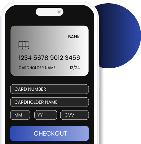
Say Goodbye to Complex Checkouts!
We develop a one-step checkout and integrate the necessary tools to minimize abandonment rates. Plus, it unlock the potential for upselling.
A website's product listing page (PLP) displays a list of items based on a category or search term. Due to the fact that it directs users to product detail pages and advances them toward conversion, this page is a crucial component of the eCommerce experience.
An eCommerce business's revenues might go up dramatically with a well-designed product listing. Customers may quickly locate the item they require, examine it in depth, compare it to competing offers, read customer reviews, and eventually make a buy.
#1. First, fake product pods #2. Boxes at the top of the page listing product categories #3. Product pods with browsable images of products #4. A synergy of SEO and UX design