Your customers have spent time browsing your online store, exploring products and reading descriptions. They have packed their carts with their favorite items and are ready to check out.
At this stage of their purchasing journey, they want a quick and easy purchasing experience. If your store’s shopping cart checkout process appears complicated, they may bounce. In fact, around 7 out of 10 potential customers abandon their carts without finishing the purchase.
Losses from abandoned carts are costly. $18 billion of annual lost sales revenue is attributed to customers abandoning their carts at the final stage of the sales funnel.
However, many of these losses can be either recovered or prevented. To be successful, eCommerce businesses need to build an optimized shopping cart page to anticipate clients’ needs and deliver a seamless experience that drives conversions.
In this article, we’ll share compelling approaches to crafting the best eCommerce shopping cart experience and explain how you can implement them into your business.
- 12 Best Practices for Shopping Cart Optimization
- Optimized Shopping Cart: What It Is and Why It’s Vital in Online Sales
- Top 5 Tools for Shopping Cart Optimization
- Best Practices for eCommerce Shopping Cart Optimization
- How to Find Errors in the Steps of the Checkout Process?
- Final Thoughts
Get an eCommerce Expert Consultation
Our Adobe Business Practitioner will audit and optimize your site for robust performance.

12 Best Practices for Shopping Cart Optimization
The primary task of your shopping cart page is to guide your clients to the moment when they make a payment. All the text and design elements must have a single goal: to help a shopper seamlessly reach the Purchase button.
There is fierce competition in the eCommerce landscape. Each negative aspect of your store is a reason for your customers to go to your competitor.
Based on our vast experience in online retail, we’ve collated 12 tips to consider when optimizing your shopping cart.
1. Display an Exhaustive Product Summary
Before your shoppers confirm their orders, they should be able to double-check the items they’ve selected for purchase. Help them make sure they’ve picked the right items by summarizing the main product information alongside an image.
Full transparency at the final stage builds trust and prevents purchase errors.
Include the following in your order review summary:
- Item name and photo
- Key characteristics, such as size, colour and price
- Delivery cost, discounts, gift cards, taxes, and other cost-related information
- The total amount to be paid (in local currency, if possible)
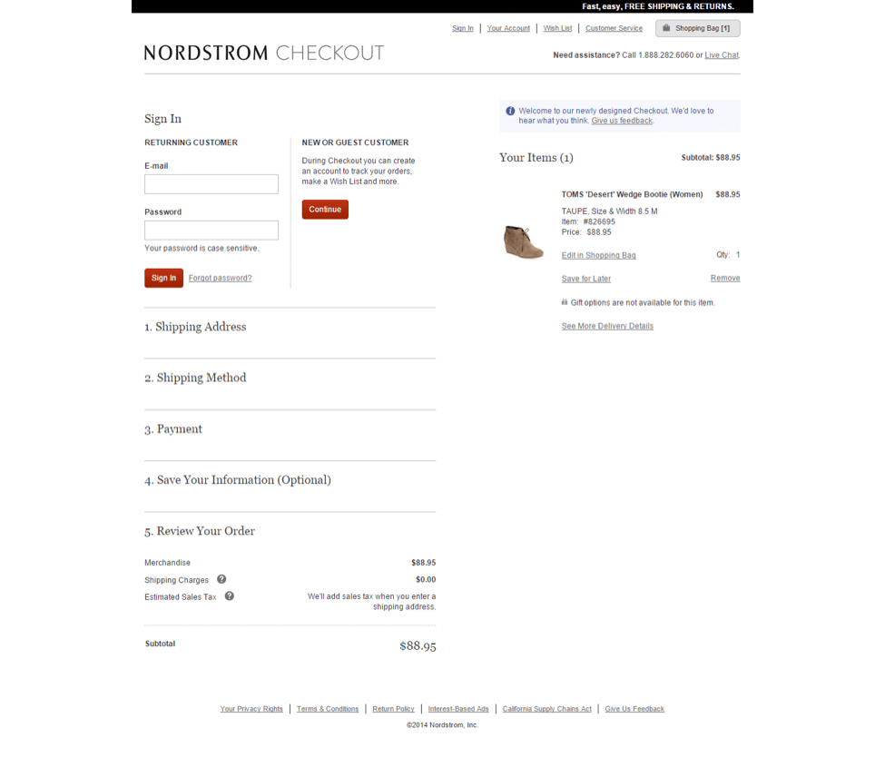
Nordstrom’s online checkout is a great example, with a clear product summary, image and payment details.
2. Ensure Your Shopping Cart UX is Mobile-Friendly
More and more people are using their mobile device to buy online. Due to the growing popularity of tablets and smartphones, over 40% of eCommerce sales in 2024 are expected to be made via mobile devices. This is a solid reason to invest in crafting a professional, easy-to-use mobile version of your website, including the checkout page.
What should you pay attention to when creating a seamless shopping cart UX for mobile?
- Make sure your website automatically adjusts its layout and content based on the screen size (responsive design).
- Simplify your navigation with mobile-friendly elements, such as a hamburger menu (three horizontal lines that, when clicked on, display a menu).
- Optimize the size of text and images.
- Prioritize content and remove non-essential components.
- Make all interactive elements touch-friendly.
- Optimize performance for a streamlined mobile experience.
3. Keep Your eCommerce Shopping Cart Design Clean and Intuitive
There are many design rules and guidelines for the web, some of which are easier to follow than others. Here are a few easy ones that will help you achieve a simple, clear design:
- Minimalist, uncluttered layout. Avoid unnecessary elements that can overwhelm customers. Use white space effectively to provide visual breathing room and highlight important information.
- Consistent visual hierarchy. Use size, colour and fonts to differentiate between headings, item details, pricing, and other relevant information. This establishes a clear visual hierarchy to guide users’ attention.
- Limited colour palette. The colours you use should complement your website’s overall design. Use colour sparingly and strategically to draw attention to crucial elements. Maintain a visually pleasing, harmonious colour scheme.
- Intuitive icons. Use simple, intuitive icons to represent essential functions within the shopping basket. Make sure the icons are easy to recognize and don’t require additional explanation.
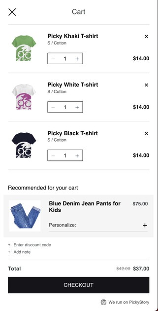
Picky’s cart view uses a simple, appealing design with minimal text, so customers can concentrate on the key details.
4. Make It Easy to Edit the Shopping Cart
Your customers should be free to change their minds about the items they’ve selected. Let them easily add or delete products and switch between your website and their shopping cart without losing the information they’ve already entered. Empowering shoppers to edit their orders at any time will go a long way to preventing cart abandonment.
User-friendly eCommerce shopping cart solutions allow customers to return to their orders whenever they wish, with all the information securely stored in the bag. This feature can also be used as an upselling opportunity if you offer personalized complementary products.
Turbocharge Your eCommerce Site
Don't let low site speed and lost customers hold you back. Thorough audit by our BA and dev team will boost your conversion rate.
5. Eliminate Non-Essential Information
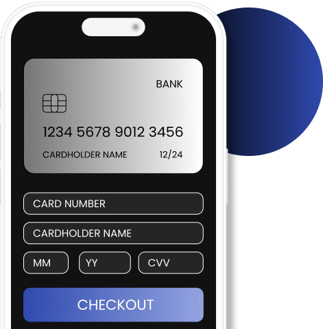
The main purpose of your checkout page is to allow users to fill in the required fields quickly and easily, then complete their purchase smoothly.
Focus on this user goal and remove any distractions or redundant information that could distract the buyer. A minimalist design with clearly designated form fields will help the user to complete their task effectively.
Use templates for your eCommerce shopping cart design that feature a balance of the right elements and a clean design.
6. Reveal the Shipping Costs Early On
Unexpected extra costs are one of the primary reasons for shopping cart abandonment, accounting for about 48% of buyer outflow. If shoppers discover additional shipping costs only after adding an item to their shopping bag, they may reconsider their purchase.
Inform your customers of all the fees upfront so they know what to expect and are more likely to complete their order.
7. Provide Autofill Fields
Another way to improve your customers’ checkout experience is to use autofill fields. Manually typing in an address, for example, makes the order process longer than it needs to be.
By making your customers’ journey easier in this way, you’ll be rewarded with higher conversions. This is particularly relevant for mobile shoppers, as forms may be more difficult to complete on a smaller screen.
Another benefit of offering an autofill option is ensuring the shipping information is correctly entered. This is a bulletproof way to avoid potential delivery mistakes.
8. Offer Different Payment Options
Offering multiple payment options will increase the likelihood that your users will complete their purchase.
If you operate an international eCommerce business, offer the currencies used in the countries where the majority of your visitors come from.
You can personalize payment options based on the customer’s IP address. Calculate the prices and final total in the user’s local currency.
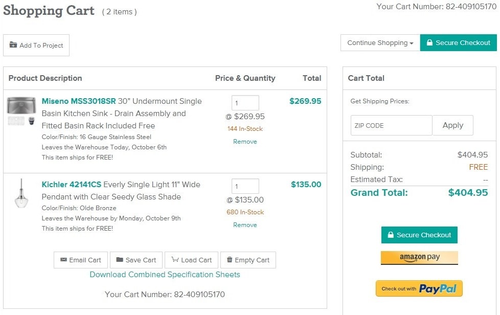
In the example above of Build.com, we can see traditional credit card options offered, as well as Amazon Pay and PayPal. The store also offers to use existing payment information for repeat buyers who prefer not to keep entering their payment information.
9. Provide a Guest Checkout Option
You want your visitors to register at your online store and convert into loyal customers. However, don’t prioritize this over your user experience. First-time buyers may bounce if forced to go through a registration process.
Don’t force your visitors to create an account. Checkout process optimization includes offering the choice of registration or purchasing without setting up an account.
By offering a guest checkout option, you’ll meet users’ expectations of a quick purchase and increase the possibility they will come back. After all, a satisfied consumer is highly likely to return.
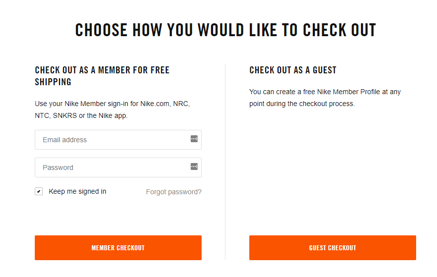
Above is an example of Nike’s guest checkout modal. Customers can choose to become a member and enjoy free shipping, or check out as a guest for convenience.
Unleash Store Management Power
We'll create a simple admin for you to process orders quickly and open new doors for marketing and sales.

10. Build Trust by Displaying Security Seals and Badges
18% of abandoned carts are attributed to a lack of confidence in payment security. Visitors must feel safe when interacting with your store. Since they need to enter their personal information and card details, there must be no room for doubt about the reliability of your website.
How can you reassure your shoppers of your store’s credibility?
A variety of trust signals are at your disposal. These include seals, badges, and other marks that appear on your checkout page and confirm your website’s legitimacy. Although trust is built over time, these elements can help customers to decide to finalize their purchase.
You can also emphasize your store’s reliability by using social proof, such as customer reviews, and providing easy contact options.
11. Optimize Your eCommerce Shopping Cart Loading Speed
An issue-free shopping cart experience leads to consumer satisfaction. Once your shoppers have bought a product, they want their order confirmation as soon as possible.
Provide a fast load speed for the purchase confirmation so they quickly know their order has gone through. The quicker the process, the happier your customers will be, confident about the purchase they’ve made.
Fast-loading checkout pages also increase the likelihood of a customer returning as they will remember the experience of buying from your site as pleasurable.
12. Add Live Chat
If you can quickly resolve your potential customers’ needs, they are more likely to convert to a purchase. Live chat can address customer queries incredibly quickly, often outpacing conventional support channels.
- 63% of consumers claim they’re more likely to go back to a website with live chat than without.
- Live chat can increase conversions by 40%.
The reason behind these statistics is obvious: live chat can deliver immediate information on product characteristics, delivery options, fees, discounts and more. Such speedy support keeps consumers updated about products, facilitates a smooth checkout and builds a rapport between customers and brands.
Buyers may have questions during the shopping cart checkout process. For instance, if they’re purchasing clothes, they may wonder if a different color or size is available, or have queries about delivery times or your return policy.
Offering live chat can provide them with this information right away without having to call or send emails.
Dominate Search Engines
Don't let your products go unnoticed. Implement the latest SEO trends and watch your visibility soar.

Optimized Shopping Cart: What It Is and Why It’s Vital in Online Sales
An optimized shopping cart refers to a user-friendly interface that enhances the online shopping experience. It removes any obstacles at the checkout process, offers clear navigation, displays relevant product information, and provides convenient features like saved carts and multiple payment options to facilitate customer delight.
The fundamental criterion of a successful shopping cart is a clear, simple, and fast UX. According to this 3-component formula, the cart page should:
- Concisely display the vital information. The need to scroll too far or visit another page may deter consumers.
- Avoid misleading a customer or providing confusing information. Intuitive design and straightforward content streamline the customer experience.
- Download quickly. Slow checkout pages are one of the primary reasons why shoppers drop off.
Why is shopping cart optimization crucial to eCommerce sales?
As it was mentioned earlier in the text, 7 out of 10 shoppers leave their carts unprocessed. This means that for every dollar earned, about three dollars potentially slip away. In total, merchants lose $18 billion in sales revenue annually due to cart abandonment. This is a convincing reason to apply best practices and techniques to minimize this undesired occurrence.
Top 5 Tools for Shopping Cart Optimization
A smooth and painless checkout leads to greater customer satisfaction and lower cart abandonment. But how do you figure out which tactics work best for your store? Here is the list of exemplary shopping cart optimization tools aimed to ease your path.
CartInsight
The CartInsight is a powerful analytics platform designed to provide comprehensive insights into consumer behavior throughout shopping cart completion. By tracking user interactions, CartInsight offers precious data on abandoned carts, conversion rates, popular products, and user demographics. Its features help businesses identify trends, optimize conversion funnels, and implement targeted strategies to reduce cart abandonment rates.
CartOptimizer
CartOptimizer is a sophisticated solution designed to expedite the checkout process. Leveraging advanced algorithms and user behavior analysis, the tool identifies bottlenecks in the checkout flow and provides recommendations to effectively eliminate them.
CartPerfection
Another innovative ecommerce solution, CartPerfection is tailored to refine the online shopping cart performance. Through meticulous analysis of user interactions at the checkout stage, CartPerfection implements the best practices to fine-tune every aspect of shopping cart operation.
Hotjar
Hotjar is a powerful analytics and feedback tool that allows businesses to understand shopper behavior on their websites. It combines heatmaps, session recordings, and user feedback tools to deliver insights into how visitors interact with web pages. This information shapes a solid background for identifying weak areas and building an optimized shopping cart.
VWO
Visual Website Optimizer (VWO) is a comprehensive optimization platform that enhances a brand’s online presence. A/B testing, multivariate testing, heatmaps, user behavior tracking, and other handy tools introduced in this all-encompassing solution allow businesses to experiment with different website arrangements and drive UX.
Best Practices for eCommerce Shopping Cart Optimization
Let’s explore several prominent examples of successful shopping carts.
Amazon: Efficiency and convenience
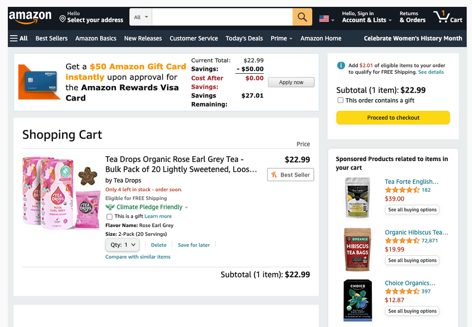
With features like one-click ordering, persistent shopping carts across devices, and personalized product recommendations, Amazon has mastered the art of refining the purchasing path. Their smooth checkout process, coupled with a vast product selection, fast shipping options, and secure payment methods, demonstrate the efficiency of the optimized shopping cart.
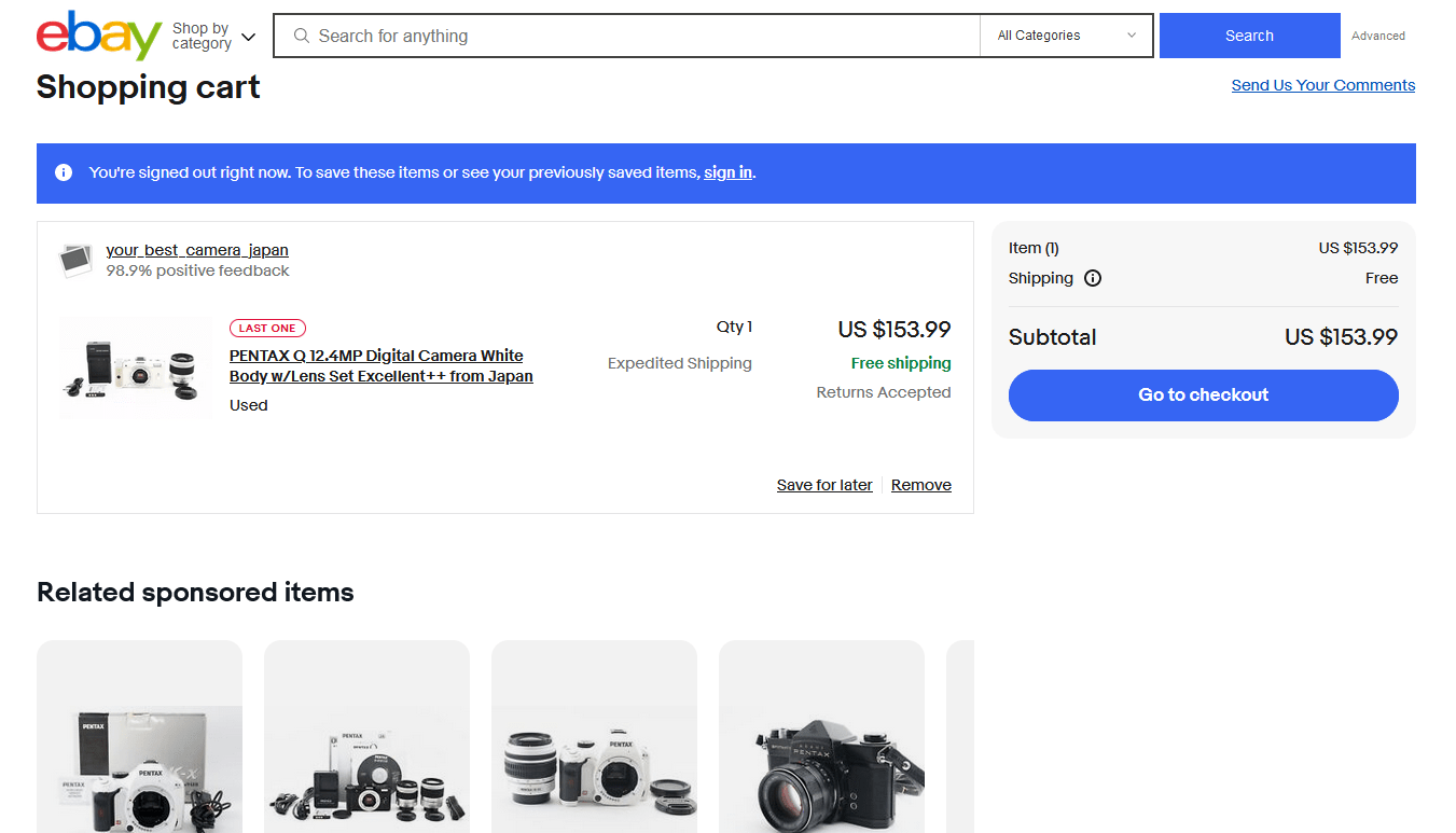
eBay: Flexibility and accessibility
Offering both guest checkout and account registration options, eBay caters to a wide range of users and encourages impulse purchases. A consumer-friendly interface, transparent shipping and return policies, and integrated payment solutions contribute to a positive UX and high conversion rates.
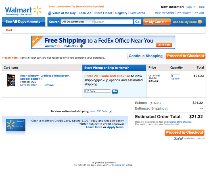
Walmart: Affordability and comfort
Walmart stands out for its rich checkout information and features. Easy reorder options, savings alerts, in-store pickup for online orders, and other opportunities grant a seamless omnichannel shopping experience. Clear product descriptions, customer reviews, and price-matching policies help to build trust and loyalty.
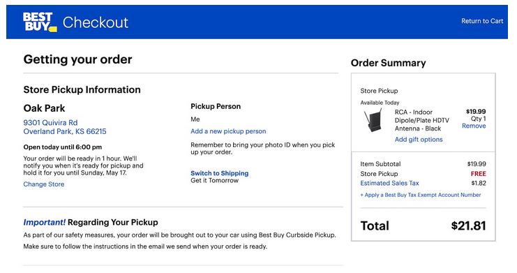
Best Buy: Product expertise and customer support
Offering such options as product comparison tools, expert reviews, and live chat support, Best Buy helps users make wise purchasing decisions. Their flexible delivery system, hassle-free returns, and loyalty program rewards contribute to a positive shopping experience and amplify consumer loyalty.
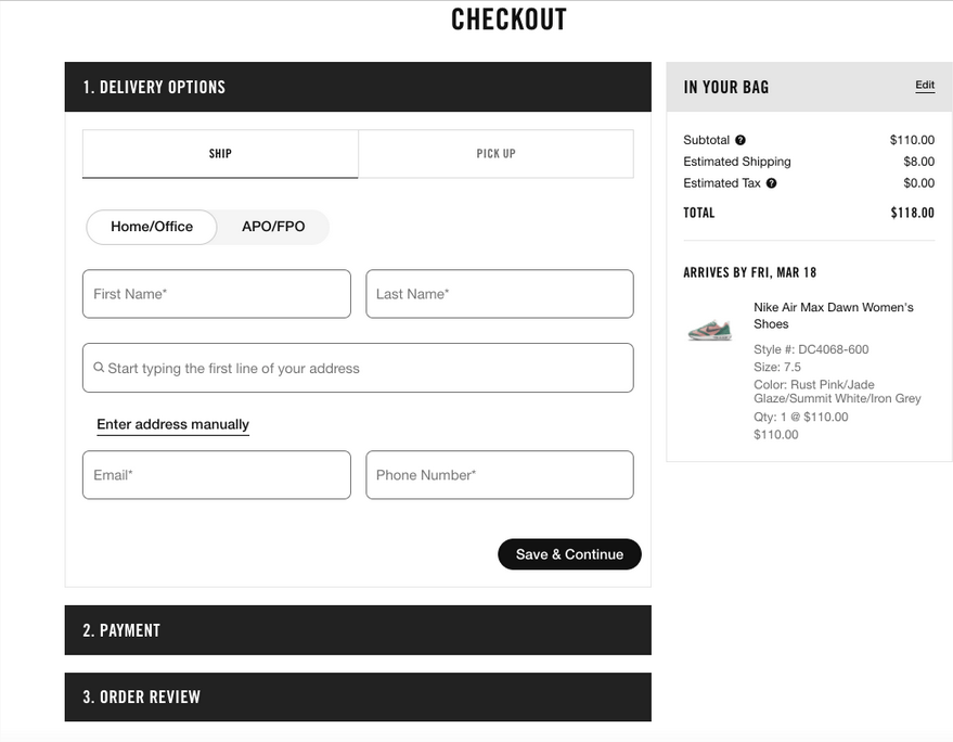
Nike: Innovation and engagement
Nike’s shopping cart is definitely worth highlighting. It seamlessly integrates with the entire Nike ecosystem, with its commitment to innovation and customer delight. An excellent example of breadcrumbing and personalized recommendations, this shopping cart also offers an informative interface with a product description.
No More Lost Customers!
We offer tech audit and implementing of new theme with a hot feature set to rekindle customer interest and drive additional sales.

There are several methods for checking for errors during the checkout process. Let’s take a look at a few of them.
How to Find Errors in the Steps of the Checkout Process?
One of the best things you can do for your online store is to use Google Analytics reports to track your checkout process. Approximately 88 percent of eCommerce shopping carts are abandoned, according to Statistica. Because most online stores’ checkout processes aren’t optimized, this is a significant loss.
With Google Analytics Reports, you can see how your customers progressed through each step of the checkout process. With it, you’ll be able to identify the section of the process where customers are most likely to abandon it. You’ll be able to optimize your checkout process and ensure that your customers finish it.
Google Analytics Reports
Third-party integrations make your eCommerce shopping cart run more smoothly and quickly. It’s best if you can gain customer trust while keeping the process running smoothly. Customer trust can be built using integrations such as the Paypal payment portal or the UPS shipping gateway.
Third-Party Integrations for Enhancing of the eCommerce Checkout Process
The beauty of Hotjar is that you can track your visitors’ shopping carts all the way to the checkout. You can watch them fill out their information in real-time and see what caused them to change their minds before abandoning the cart. You can use surveys, heatmaps, polls, and other tools.
Hotjar
With Crazy Egg, you can track each customer and see where they leave their cart when they abandon it. You can get heatmaps, recordings, A/B testing, and a lot more with this software.
Crazy Egg
Final Thoughts
An optimized shopping cart is crucial for increasing conversion rates, building trust, driving sales and encouraging loyalty. With all that in mind, what is the best shopping cart for eCommerce?
To answer this question, you must first understand why customers drop off at the checkout phase and how to reduce shopping cart abandonment. Then, use shopping cart best practices to build a user-friendly cart best suited to your online store.
It’s a good idea to hire professionals to help you navigate the overwhelming choice of breakthrough technologies. At WebMeridian, we have huge experience in software solutions for online retail.
eCommerce shopping cart development is one of our areas of expertise. We will carefully analyze your business needs, website performance and UX to determine the most efficient shopping basket design for your business.
Contact us today so we can start moving towards your stellar eCommerce shopping cart solution together.


